If there's one thing that the new world of COVID-19 has shown us, it's the power of home improvement. On those weekends with no plans (not that there was ever much to do), we have found ourselves looking for every little thing we can change or make better in our own home, because we are now spending more time than ever before inside them.
While many of us have taken to our gardens to begin those colossal projects that have been in the pipeline ever since we can remember, or even transforming the empty bedrooms into home offices or even 'zen-zones' to really bring our homes to life, the rest of us have discovered the power of a simple coat of paint to really make the home pop.
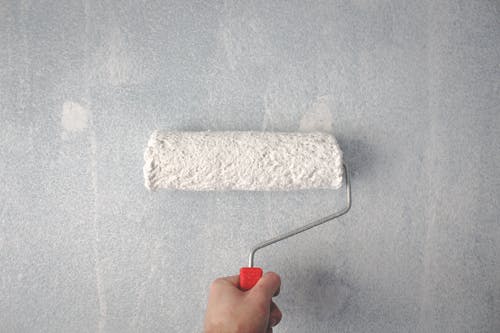
When comparing the effort behind a complete living room renovation to a simple room refresh, we all know which option will most likely prevail. There's really no quicker or easier way to breathe new life into your home than with a coat of paint. Even the slightest change in colour can completely transform your home, or even feel like you're in an entirely new property altogether. However, choosing the right colour is where the real difficulty lies -- you're compelled to choose something aligned to your favourite colour, yet almost forced into staying on-trend or fashionable, especially if you're planning on selling somewhere down the line.
Once inspiration has struck, and you've found a balance of something bold, beautiful and trendy, it's also important to note that your new natural has to be something that you'll still love later down the line. Lucky for you, we've done the research behind what the top paint colour trends are of 2020, and what will set the scene for future years to come.
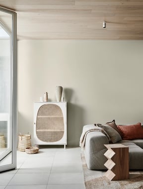
Soft green & grey
A gentle, yet very appealing mix of soft green and putty-like tones, will bring an effortless sense of relaxation and zen into any room of your home. Andrea Lucena-Orr, colour planning and communications manager at Dulux Paint says “It’s a soothing neutral and natural palette with a sense of warmth that works beautifully with this season’s underlying brown base.” Bringing a natural and earthy touch to the home will harmonise the separation between your indoor and outdoor living spaces, and instantly provoke a sense of peace an tranquility into your soul. Andrea also goes on to say that it's “an easy palette to use and would work in just about any space in the home.”
Sources: Dulux Paint
Complete the look with:
Natural timber, rattan designs, matt-finish ceramics, boucle-finish soft furnishings.
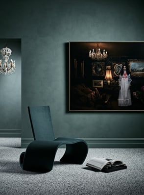
Moody Hues
If you really want to bring bold into your home and create a centre for deep conversation and stimulation, dark hues of blue and grey will not disappoint. These tones are hugely popular and will stand the test of time according to Melanie Stevenson, marketing manager at Porter's Paints. "Complex, deep greens, black forest greens, decadent, blue-greens and vibrant olive tones are creating a lot of interest," she says. "“French Wash paints are also having a resurgence. Not the tobacco-yellow washes of the ’80s – a French Wash finish is now being used to create sophisticated concrete-look walls, using subtle tones of grey."
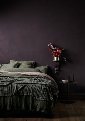
Sources: Porter's Paints
Complete the look with:
Dark timbers and tactile linens to really add the element of sophistication into your home.
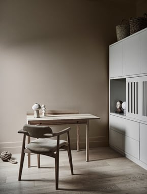
Warm neutrals
Perhaps the most popular and timeless colours of many years, are the simple arrays of warmer whites, greys and neutrals. These colours are great for opening up the space in your home, free from confinement and inviting to any guest. A simple, yet unyielding colour, the colour's popularity can be attributed to it's mutuality between most any addition in the room. Put simply, these colours will pair well with almost anything. With its warming selflessness, these colours will work to help any feature piece of furniture or decor stand out. Whether you decide to fill your room with deep green or dried grey plants, or add that splash of character and style to your couch cushion collection, you just cannot go wrong with this particular palette.
Sources: British Paints
Complete the look with:
Warm, mid-tone timber and tiles, and luxe brass, bronze and copper accents. This palette also welcomes the opportunity to add endless pieces of bold art and wild tapestry.
For more tips and tricks to inspire your next property dream, subscribe to our eNewsletter below.