
For property stylists, understanding exactly why particular colours evoke certain feelings is not a simple task.
However, it is an integral part of a successful home staging. It comes as no surprise then that there’s far more to the art of property styling than simply memorising the colour wheel.
We all know property stylists have a knack for perfectly curating spaces to make your property shine. Carefully chosen colour palettes can have a significant effect on your mood, thoughts and even productivity. These subconsciously evoked feelings can be the difference between a prospective buyer falling in love with your home or deciding it’s not for them, even if they can’t pinpoint why.
Personal preferences, experience, upbringing and cultural differences all play their part in influencing people’s reactions to certain shades, tints and hues. However, despite these factors, there are certain colours or colour groups that generally elicit similar reactions from most people. This is what makes it so crucial to choose colours wisely when it comes to decorating for sale as you’re relying heavily on buyers’ emotions.
We sat down with Marion Taylor, Owner and Director of Tailored Home Styling, to understand how her team of property stylists use colour psychology when staging your home for sale.
What process do you use when deciding on the colour palette to style a room or property in?
“We always go to the house in person, either in the quote process or prior to install, so we can walk through it and see exactly how a house looks and feels. We assess the home on its individuality and a colour palette is tailored for each house carefully.”
What factors impact your decisions?
“We consider the era and design of the house, along with key features of the home such as timbers or stones, and the existing colour palette that may already be showcased throughout the home. For example, if they have gold or black tapware, or coloured mosaic tiles, we compliment those colours rather than clashing with them.”
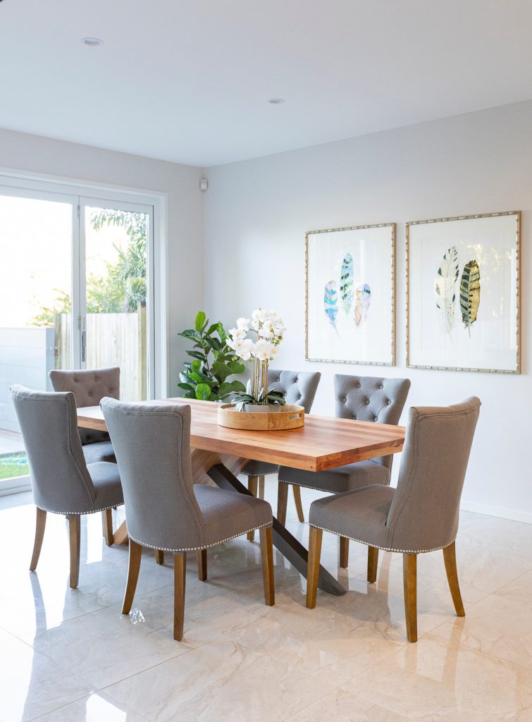
“We always consider the natural light of the home - if there’s limited natural light then we will bring in pieces that brighten the space and not make it feel smaller, such as off-white couches, and light oaks.”
“When we use colour, we need to make sure it is on-trend and is attractive to a broader market rather than our own individual taste. We want buyers to feel relaxed and comfortable when walking into a home, allowing them to see the house in its best form.”
Do you find different age groups have different reactions to certain colour schemes?
“We find there are generational differences in interior styling tastes. Empty nesters respond to “traditional” colours and textures that they associate with strength and luxury, such as blue and beiges. Versus millennials, who respond to rich and earthy colours, such as emerald greens, tan, blacks and whites.”
Which colours do you find work best in particular spaces/rooms?
“To give a fresh, crisp feel we generally use whites and creams. We find when styling a bed, for example, the white linen provides a backdrop for coloured and textured cushions and throws. The same could be said for beautiful, white linen couches. If too many colours are thrown together, it distracts from the space and becomes offensive to the buyer’s eye.”
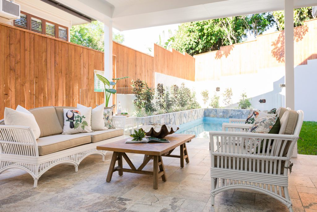
“In smaller spaces, we try to stay away from dark colours and stick with light grey, white and off-whites. For spaces that are quite vast, we use soft furnishings such as rugs that have a deeper hue of colour and texture, as well as the introduction of coloured pieces such as emerald greens, plum and deep navy blue with accents of gold.”
Are there any colours you avoid as a general rule?
“Absolutely, red. In real estate photography, red becomes over-exposed, and it makes it difficult for the eye to focus on anything around it. More than that, red is quite powerful and is immediately associated with pre-conceived ideas; warning signs, anger, clearance sales and food brands. It’s best to avoid colours that are too bold and polarising.”
When do you use:
Blue?
“We generally don’t use a true blue, but rather use a navy or a steel grey. We use blues in our Hamptons and coastal styling and at times we do bring in a deep navy for a modern install. Different tones of blue give different feelings; navy blue in Hamptons styling creates a luxurious feeling and in coastal, blue greys create a sense of relaxation.”
Red?
“NEVER!”
Yellow?
“We use mustard purely to accent when we want to create an earthy feel. We mix mustards with off-white and navy blue in styles that are fresh and modern and avoid in homes that are dated.”
Are there any other colours you find particularly useful for evoking certain feelings?
"Neutrals generally portray a sense of calm, comfort and homeliness. This also includes blues and greens which are often seen in nature."
Are there any colour myths?
“Yes, that ‘white is impractical’. Off-white couches, for example, create a base for colour and allow us to design versatile looks simply with cushions. White allows you to play with more colour, and you can buy couches with linen covers that you can easily remove and wash/bleach.”
While there can be a misconception that property styling is the same as interior design, this simply isn’t the case. Property stylists, like the team at Tailored Home Styling, use their extensive knowledge and skills to ensure your home appeals to the broadest possible market.
If you’re interested in getting in touch with Marion and her team of industry experts, visit their page here.
All images have been sourced from the Tailored Home Styling portfolio.